
For the latest on ecommerce tips and best practices.
7 Ways to Improve the Ecommerce Customer Journey for Your Store

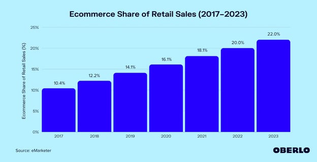
Technology has completely changed the relationship between merchant and consumer. Many businesses have seen the benefits of selling directly to consumers over the web as internet access became more accessible. Etailinsights reports, “there are currently 9.1 Million Online Retailers in the world and 2.5 Million of them are in the United States.” With the increasing percentage of online retail sales, consumers shopping online are creating more ecommerce website traffic.
As a result, using best practices in ecommerce website design is critical in turning shoppers into customers. Focusing on your customer's experience is a crucial step in conversion-focused strategy. We’ve provided a few strategies on how to improve your website through a customer journey-focused approach.
What Does the Ecommerce Customer Journey Look Like?
The customer journey is the path a user takes to complete a transaction on your website. Customers create this path through actions they make on the site. For example, when a customer clicks on a product or service, they take a step in their journey.
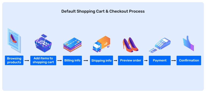
Understanding the purchasing journey of a customer can be difficult, but this basic 7-step path is a good start.
- Browse products: The customer browses a store’s products online and finds products they like.
- Add to cart: Selected items are added to the customer’s cart. Sometimes customers return to browse more products to add to their cart.
- Enter billing info: After filling their cart with items, the customer enters their billing information to confirm the correct source of payment.
- Enter shipping info: The customer enters a correct shipping address and selects the desired expected arrival time of the product.
- Preview order: Once order information is entered, the customer previews the order to make sure the correct information and products are selected.
- Pay for the order: The customer submits the order and the transaction is complete.
- Confirm the order: An order confirmation ensures that their order was submitted and received by the company.
Mapping an Ecommerce Customer Journey
A helpful way to understand the experiences your customers have with your brand and product is to map it out. Visual customer journey maps lay out every touchpoint, or part of the customer experience, in order to analyze and understand what is working and what needs improvement.
These tips will help you in creating your own ecommerce customer journey map:
- Sketch out your map using websites like LucidSpark, your laptop, whiteboard, or even pencil and paper. Creating a visual representation of your customer journey will help you see it more clearly and fill in the details you need.
- Watch customer behavior closely to pick up on trends and determine their path to purchasing. Are they going straight to what they want and then heading to the shopping cart? Do they browse several products? Do they get stalled after they put their items in the cart? As you keep a close eye on behaviors, you’ll hopefully pick up on patterns.
- Gather data that shows how customers found your site, how long they stayed on pages, and what behaviors triggered conversion. A good analytics tool—like Google Analytics, which is free—can help you find that data.
- Include all customer pain points you can think of for each touchpoint on the map. This will help you understand and resolve the pain points for your customers, making them more likely to complete the purchase.
- Put yourself in your customers’ shoes to understand what they experience. Direct customer feedback or a second opinion is helpful information to gather. Consider sending customers a review link and/or a survey link with a “thank you for purchasing” message.
- Create multiple maps for a few different types of target customer personas. Identify groups of customers with similar characteristics—like age, gender, income, or other markers—and use these customer personas to discover what their various ecommerce customer journeys look like.
7 Ways to Improve Your Ecommerce Customer Journey:
Customers want a clear, smooth visual online experience. However, as a business, you want to ensure that your customer has the least amount of obstacles in reaching check out. A few factors that could affect this experience are included below:
1. Have Clear Calls to Action
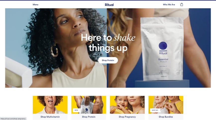
Clear calls to action on the homepage of your ecommerce website immediately signal to shoppers what actions they should take. Quick clicks to categories of your products or services give shoppers a brief visual overview of what your products or services are. This also helps you qualify visitors who are looking for something different as soon as they get on your site.
2. Use a Dynamic Search Bar and Filtering Feature
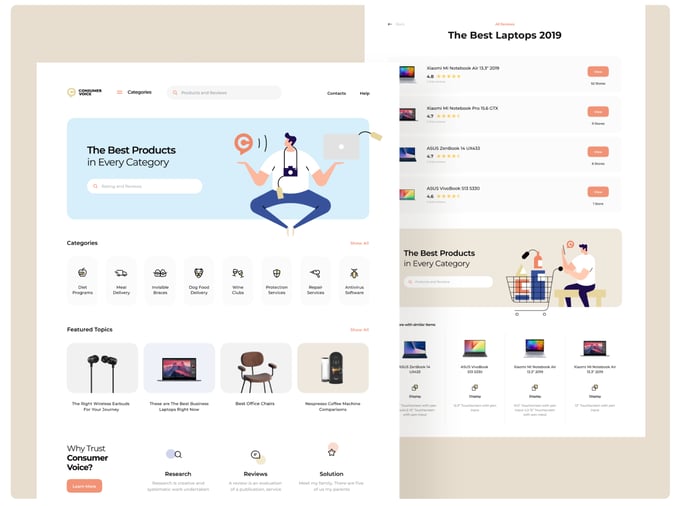
New visitors on your website may want to quickly research a product or service you offer. Having a prominent search bar and a sophisticated filter can reduce redundancies in the header menu and allows users to search for products they are looking for from one place.
3. Make Mobile Optimization a Priority
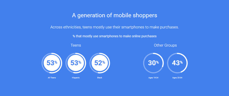
According to Dynamic Yield, 76% of consumers shop on mobile devices because “it saves them time.” As a result, businesses must pivot their user experiences by optimizing their site for mobile devices. Tailoring your user journey to the customer gives them the incentive to keep coming back.
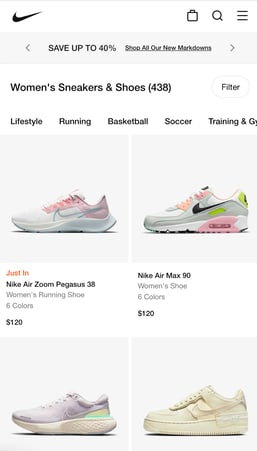
Your mobile website experience should not mimic your desktop experience. Remember, a customer on their mobile device will be using a smaller screen to navigate your website.
Follow these tips to make your ecommerce website mobile-optimized:
- Use large buttons for call to actions.
- Be concise. Less is more when it comes to content.
- Condense navigation bar for ease of access.
- Use large high-quality product images.
A mobile-optimized website provides a less frustrating shopping experience, leading to more conversions and happier customers.
4. Declutter Your Website
Reducing page clutter allows customers to feel welcome to the site. Through visual aids, customers can make quick decisions on what products they are interested in. If the product directory page is hard to navigate, your visitors might choose to bounce or exit—which is both an interrupted journey and a missed opportunity.
Remove distractions from your customer journey by using these tips:
- Get rid of old content from pages.
- Review current content to assure it’s still relevant.
- Make sure that colors, fonts, and spacing makes your site easy to view and understand.
5. Give Easy Access to Customer Support, Return and Shipping Policies
Shoppers are trying to answer a number of questions before deciding to make a purchase:- Will I be able to return this item?
- How long do I have to return this item?
- Will return shipping be free, or do I have to pay for that?
- How long will this item take to get to me?
- If I have an issue, can I contact customer support?
- Is there a customer support phone number? Email? Chat?
Make sure shoppers can easily answer these questions at any point or on any page on your site. A clear menu navigation helps with this, along with secondary navigation links to support contact information, shipping policies and return policies.
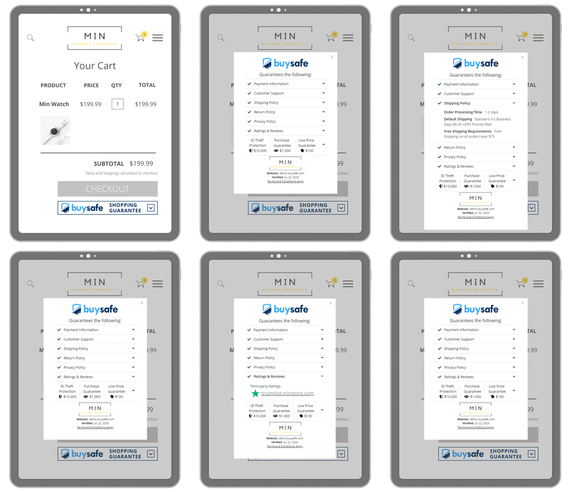
BuySafe provides an easy solution, providing trustmarks on every page of your site that pop-up a Business Transparency Profile that quickly answers shoppers' most important questions when deciding to purchase from you or not. Check out more on this here.
6. Decrease Page Load Time
Make sure that your ecommerce website loads fast, if possible try to get it down to two seconds. Customers expect fast-loading sites and often abandon if a site takes too long to load. Not sure where to start? Here's 7 ways to improve speed and performance on your site.
7. Write Better Product Descriptions
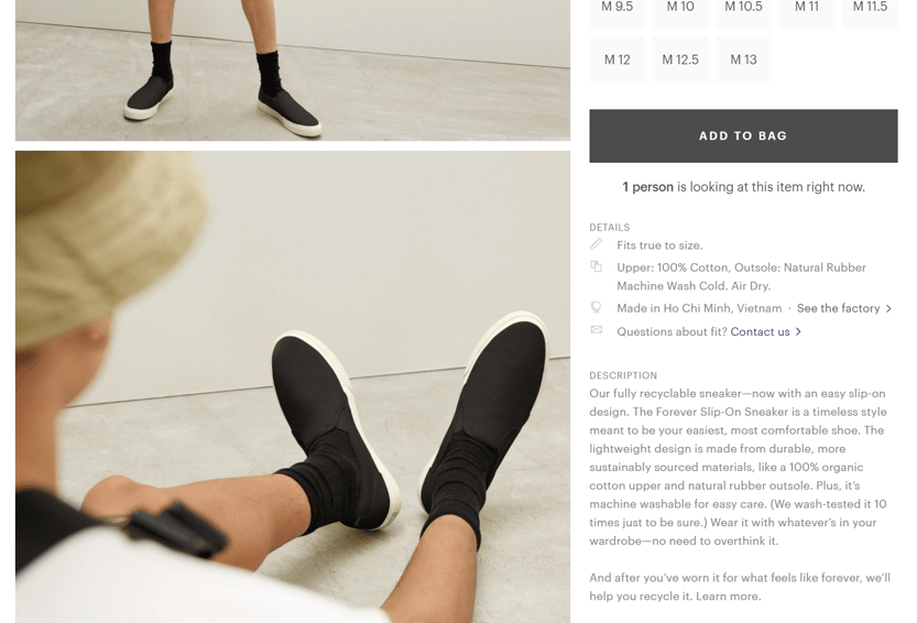
Unclear product descriptions can deter shoppers from purchasing. They want to know if the product is a fit for their needs. In the example below, Everlane emphasizes how comfortable and easy their sneakers are to slip on. Everlane also highlights that the sneaker is made from organic materials which gives incentive for those customers looking for comfort and sustainability, all in one shoe.
The key to writing a product description that converts is focusing less on product features, and more on how your product can solve your customer's problems. Doing this will move customers along their journey in a positive way.
How to Gather Information About your Current Ecommerce Customer Journey
The best way to get to know your customer journey for your store is to get feedback from your customers! You can gather that feedback in a number of ways:
- Ask for a review. You can send a review request either with a “thank you for your purchase” message immediately after they make their purchase, within 24 hours, and/or after they receive their product. Make it specific to their purchase experience or customer journey.
- Send a customer survey link. Surveys are a great way to get more detailed information on how things went. Make it simple for your customers to fill out, and you’ll get more responses.
- Pay attention to the reviews and comments you receive, especially the negative reviews. Every company gets the occasional disgruntled customers who are just in a bad mood, but if you’re getting multiple negative reviews that have a similar theme, it’s time to make some adjustments.
- Stay on top of site errors. Make sure your links are all working properly—nothing’s more frustrating as a consumer than clicking on a link to a product you’re excited about and getting a 404 error. Do regular checks to monitor the situation, and make sure your site is error free. Doing so will improve the customer journey.
Final Thoughts
The best ecommerce customer journey you can create stems from understanding that not all your customers follow the same path to your website – some start with a Google search for answers, others discover you on social media or digital ads. Make sure you are considering each customer's journey on your site so they can easily find what they are looking for and complete a purchase.
Stay in the know
Subscribe to the buySAFE blog and receive the latest in ecommerce best practices.

