
For the latest on ecommerce tips and best practices.
Ecommerce MD: The Cure for Shops With Increased Traffic But Stagnant Sales

An increase in website traffic without a subsequent increase in online sales is a common ailment among ecommerce stores. The good news: A boost in traffic to your online store means you’re doing something right. Whether it’s well-designed ads or skillful SEO, your marketing efforts are paying off. Your next step now is to analyze this traffic, then experiment with adjusting certain aspects of your store to get more of it to convert. Read on for details on how to get your ecommerce store into better health!
Symptoms of high traffic, no sales
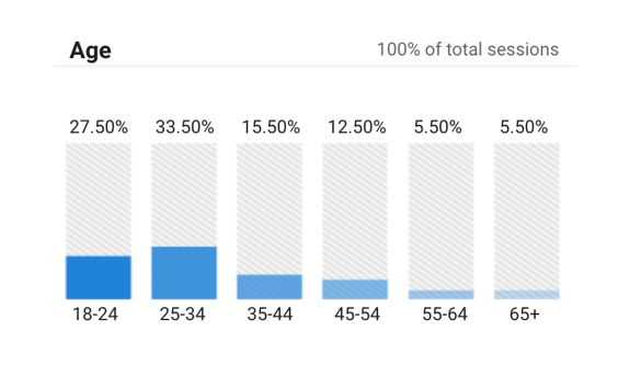
If you’re reading this, you already know your store is underperforming in terms of conversions. If you haven’t dived into the data to get the specifics yet, now’s the time. Google Analytics can tell you most everything you need to know about the particulars of this online-store affliction. View your overall traffic report on the Summary page, and compare it to the data in the Conversions section. You can even dig into advanced audience data like the age, gender, interests, behavior, and location of your site visitors to determine who is converting and who isn’t, and whether the right people are finding your site. (If not, your ad targeting may be the problem.) Step one in how to increase online sales is to closely examine the data that will give you a more complete picture of the problem.

Google Analytics can give you in-depth data about your site visitors so you can see if you're attracting the right type of traffic: your target audience.
Causes of high traffic, no sales
What’s the root cause of this ecommerce illness? Why are prospects visiting your ecommerce site but not converting? The reasons typically fall into three key categories, all of which have to do with the customer experience on your site:
- Lack of ease. Ease of access is the name of the game in modern ecommerce. If it’s not quick and easy for shoppers to load and navigate your online store, they’ll go elsewhere without much hesitation.
- Lack of trust. Shoppers have to feel confident in your brand’s trustworthiness before handing over their hard-earned money for one of your products. If something feels off, they’re likely to leave without buying.
- Subtle details. While it’s definitely a smaller category, sometimes a shopper not buying comes down to a subtle detail about your site. It could be something about the way you word product descriptions, or the color of your CTA buttons. The little things can have a bigger subconscious impact on shoppers than you might think.
Treatment for high traffic, no sales
Try these home remedies to improve the customer experience and cure your ecommerce store of this problem, so you can meaningfully increase online sales:
#1. Make your site easier to access and navigate 🧭
Take steps to make your website easier and more pleasant for shoppers to explore. To do this, you can:
- Run a speed test. 53% of shoppers say they’ll leave a website that takes longer than three seconds to load. Run the free test in seconds. If your site’s load time is lagging, the readout under your results will give you recommendations on how to improve it.
- Optimize for mobile. Almost 75% of ecommerce purchases are now done on a mobile device. If the shopping experience on your site is slow, confusing, or disorganized on mobile, you could be missing out on up to three quarters of your potential sales! Take advice from Shopify on how to optimize your site for mobile shoppers.
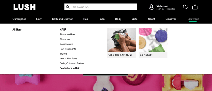
- Create intuitive navigation. Consumers are used to a certain style of navigation when it comes to online shopping websites. Make sure yours matches this basic design: categories listed along the top or to one side, and footer navigation where shoppers can find FAQs, contact details, and basic brand information. Keep the navigation uniform across all pages so prospects can always find what they’re looking for.
 This cosmetics brand does a great job of organizing their many product categories into easy-to-understand tabs at the top of every page, where most shoppers are already used to looking for navigational elements.
- Add a search bar. Moz found that conversion rates almost double when shoppers use the on-site search bar to find what they’re looking for. If you don’t already have one, just adding a quality search bar to your website can have a powerful effect on conversions.
#2. Inspire trust 🤝
Unfortunately, there are many untrustworthy ecommerce sites out there. The average consumer knows this all too well, which is why they’re typically on the lookout for signs they can trust a new online store they’ve come across. To increase your online sales, help them out! Make proof of your brand’s trustworthiness easy to find so that shoppers won’t hesitate when considering buying from you. Here are a few ways to do so:
- Fine-tune your site’s design. An unprofessional-looking website is an untrustworthy website. That’s how the mind of the modern consumer thinks, anyway. Studies show that 75% of website credibility comes from design, which means that you need to pay special attention to yours. Does it have a cohesive color palette? Do the fonts match? Is there an official logo? Does the text have a consistent style and tone? Get a friend or a professional to review your site and share their first impressions, then polish it up by taking their feedback into account.
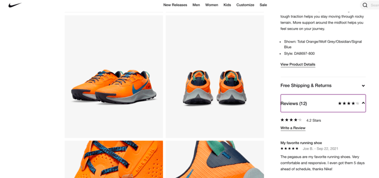
- Display customer reviews. 79% of shoppers say they trust online reviews as much as personal recommendations. Reviews can be an incredibly powerful force when it comes to how to increase online sales. In fact, research shows that displaying real customer reviews on your website can increase conversions by up to 4x. Try apps like Google Customer Reviews or Photoslurp to easily integrate them into your homepage or product pages.

Displaying real customer reviews on your site can help you increase trust and, therefore, conversions.
- Get a trustmark. If shoppers can see, at a glance, that your store has been verified and vouched for by an independent third party, they’re more likely to trust you enough to buy. Consider adding a recognizable trust badge to your store’s website, like BuySafe. A badge like this can increase your conversion rates by up to 7%, because it gives shoppers the confidence to go through with their purchase. Try it free for 14 days to see how it works.
#3. Control for the little things ⚙️
There are certain things you can’t predict when it comes to consumer behavior. Sometimes, losing out on a sale comes down to something small or subtle. The only way to control for these miscellaneous triggers is to A/B test everything you can. (Remember to keep all other elements the same as you test one element at a time!) You can use tools like Optimizely or Crazy Egg to A/B test things like:
- The copy. Use heat-map information (try Hotjar or Smartlook) to narrow down which bit of your website’s text may be lackluster. If shoppers aren’t getting past your homepage, focus on the main headline and any text underneath it. If they’re stopping at a product page, take a closer look at your product descriptions. Try a few different iterations of the text in these different areas until you’ve found the one that performs best.
- The buttons. Split test the color, placement, and text of the key CTA buttons on your ecommerce website. Try making them brighter or bigger. Swap “Buy now” for “Add to Cart” or “Add to Bag.” Move them from the center to the left side, or vice versa. See which configuration has the greatest effect on conversions.
These are just two examples; you can and should split test as many of your shop’s elements as possible. Of course, we recommend spending most of your time and effort on improving ease and inspiring trust, as discussed above. Those strategies are likely to earn you the biggest bump in conversions. But once you’ve checked those boxes, consider A/B testing other aspects of your store’s website for an additional boost.
Your store’s prognosis
“I’m getting traffic, but no sales.” If this sounds like you, the problem almost certainly comes back to the customer experience on your website. If you can make exploring your online shop a more pleasant, easy, and trust-inspiring experience, your sales numbers will respond accordingly. Start with the suggestions we’ve shared here, and remember: It’s not just about doing a few quick fixes to turn things around overnight. For lasting, sustainable growth, commit to continually making these types of adjustments over time. With some experimentation and some perseverance, you can build an online store that’s consistently in good health over the long term.
Stay in the know
Subscribe to the buySAFE blog and receive the latest in ecommerce best practices.


